CHAPTER 20
DESIGNING A DIFFERENT WORLD MAP
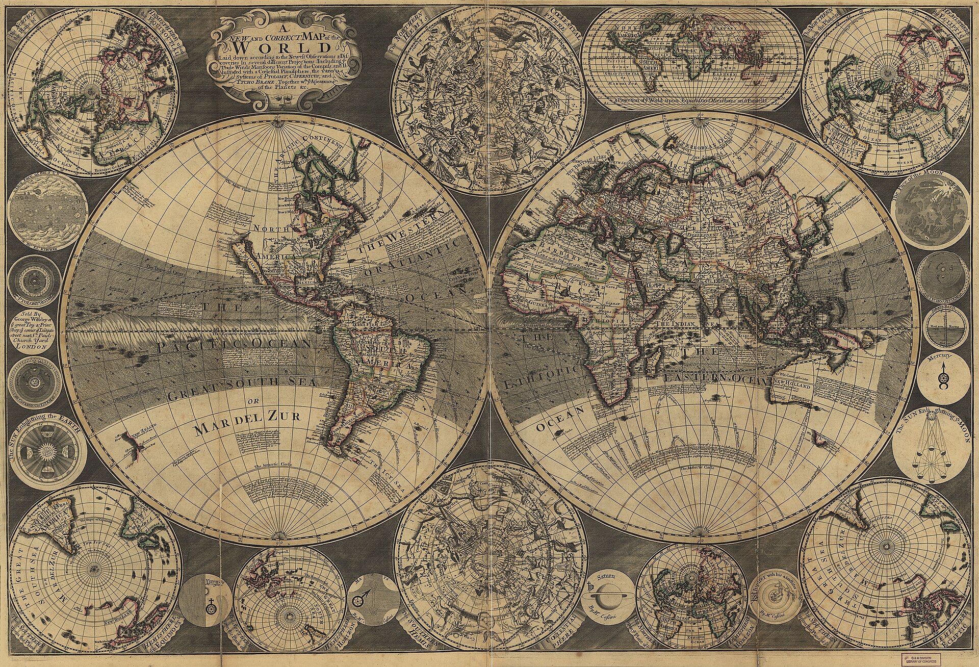
Figure 20.1. W. Godson's A New and Correct Map of the World in Several Different Projections, 1702. The sheet makes visible a fact that predates modern projection arguments by centuries: there has never been only one plausible way to draw the world. Library of Congress, Geography and Map Division. Public domain.
In March 2017, teachers in Boston were handed a different-looking world.
The city’s public schools had begun introducing Gall-Peters maps into social-studies classrooms.[1] The change attracted attention because the proportions were impossible to ignore. Africa occupied much more of the page than on a Mercator map. Greenland contracted. Europe lost visual bulk. The continents remained recognisable, but many of their shapes looked stretched or compressed.
The map was doing exactly what it was designed to do. Gall-Peters is equal-area, so a square kilometre receives the same amount of map space wherever it lies.[2][3] That fixes the relative-area problem directly, while the cost appears in shape.
The political history of Gall-Peters had already been running for decades, but the design lesson exposed in Boston was simpler. Equal area solved the continental-size problem decisively while creating a conspicuous shape and familiarity problem for many readers.


The quarrel became a warning about what happens when a world-map problem is reduced to two options. Mercator protected properties useful for navigation at the cost of relative area; Gall-Peters protected area at the cost of conspicuous shape distortion. The design space was much larger than either choice.
Three cartographers watching the Boston debate thought there should be another answer. Tom Patterson, Bojan Šavrič and Bernhard Jenny wanted a general-purpose world map that preserved area without producing the elongated forms that made Gall-Peters so difficult for many readers to accept. Their design problem had two parts: area had to be correct, but the continents also needed to look balanced and familiar enough that ordinary map readers might actually want to use the result.
The visual requirement places Equal Earth inside a much older tradition of projection design. Arthur Robinson had faced a related problem in the early 1960s when Rand McNally asked him to create a projection for general world maps. Robinson did not begin by selecting one mathematical property to preserve exactly. He began with appearance, sketching the kind of world he wanted to see and then building the numerical scheme needed to produce it.
The Robinson projection, introduced in 1963, is neither equal-area nor conformal.[4] It is a compromise. High latitudes are enlarged, but far less than on Mercator. Shapes remain broadly familiar. The curved sides and shortened polar lines give the map a rounded appearance rather than a hard rectangular frame.
Robinson’s idea was that a general reference map might be better if it looked moderately wrong in several ways rather than disastrously wrong in one.
After using Van der Grinten for its signature world maps until 1988, National Geographic adopted Robinson.[5] It first published a Winkel Tripel world map as a National Geographic Magazine supplement in April 1995. The favourable response helped lead to a later decision, implemented in 1998, to replace Robinson with Winkel Tripel as the projection for its standard world maps.
The sequence shows that even a major institutional world map can change when its designers reach a different judgement about the best compromise.
Winkel Tripel, devised by Oswald Winkel in 1921, is another compromise projection. It does not preserve area exactly and it does not preserve local angles exactly. Its appeal lies in reducing several forms of overall distortion at once. The word tripel refers to that threefold balancing ambition, usually described in terms of area, direction and distance.
For a general reference map, compromise can be a design virtue; for a thematic map comparing land area, it may be the wrong choice. That was the tension Patterson, Šavrič and Jenny were trying to resolve. They wanted an equal-area map whose overall appearance borrowed some of the visual moderation that made compromise projections popular.[6]
Equal Earth emerged from that search. The designers experimented with existing equal-area projection forms and adjusted the mathematics until they reached a shape they considered both technically sound and visually persuasive. The finished projection has straight horizontal parallels, curved meridians and relatively short polar lines. Africa retains its correct area relationship without the extreme vertical stretching seen in Gall-Peters. The edges curve inward, so the world looks recognisably like a modern compromise map while preserving area exactly.
Equal Earth did not discover equal-area mapping. Cartographers had been designing equal-area projections for centuries, including Mollweide, Eckert IV and Goode’s interrupted homolosine. Its innovation was a particular aesthetic solution to the old problem: keep true relative area while making the result easier for general audiences to accept.
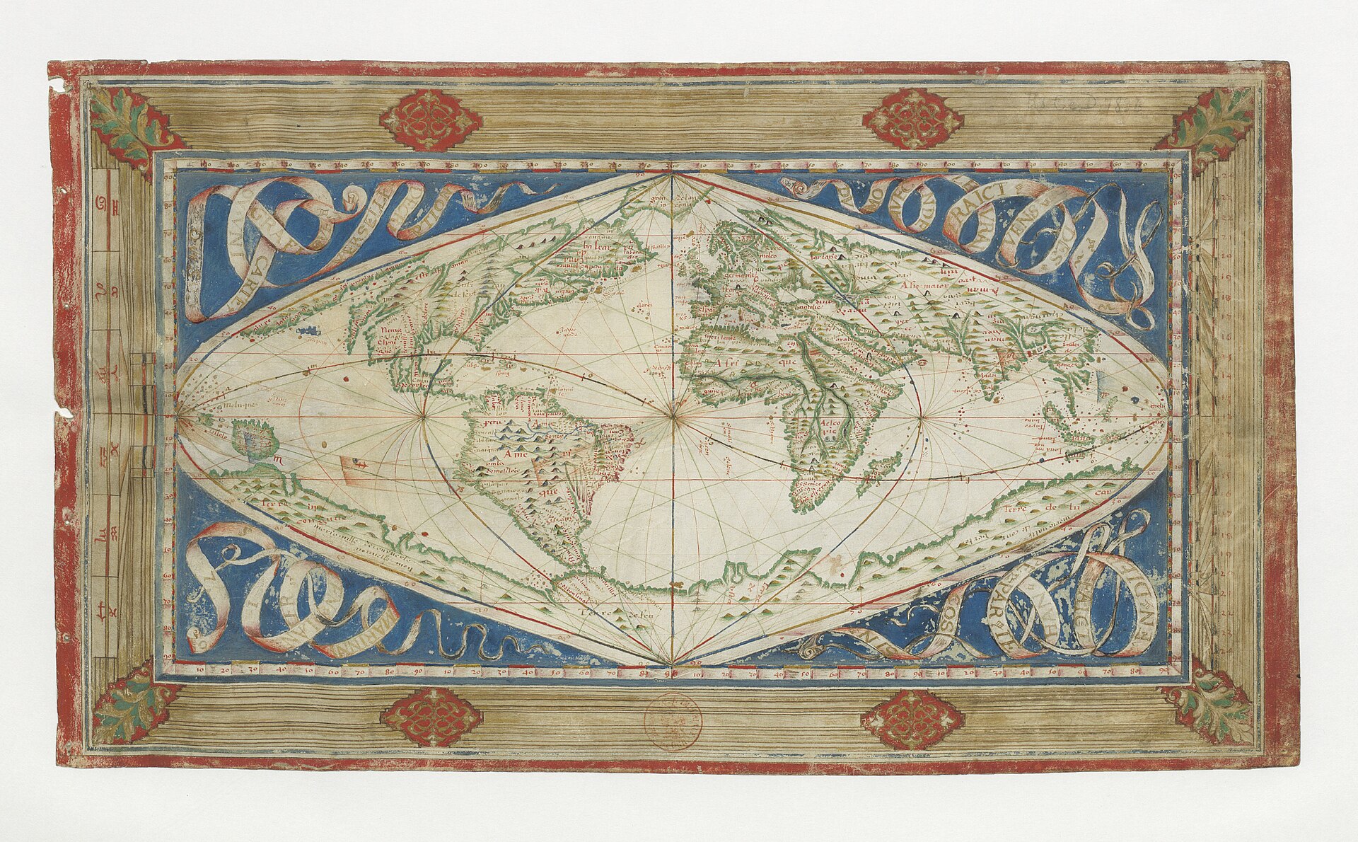
Figure 20.2. Jean Cossin's cosmographical world map, 1570. Equal Earth belongs to a much older history of cartographers searching for visually persuasive ways to flatten the world while accepting different distortions. Bibliothèque nationale de France / Gallica. Public domain.
The projection appeared publicly in 2018 and moved into software unusually quickly. NASA’s G.Projector added it. PROJ implemented it. Major GIS systems and web-rendering tools followed.
That rapid adoption separated Equal Earth from many mathematically interesting projections that remained specialist curiosities. It moved quickly from paper into open-source libraries, desktop GIS and web rendering, and a Greenwich-centred WGS 84 implementation later entered the EPSG dataset as EPSG:8857. For the design story, the important point is simple: Equal Earth was deployable rather than merely theoretical.
The word Greenwich in that name matters because it is one registered orientation, not a requirement of Equal Earth itself. The EPSG registry also defines EPSG:8858, centred on 90 degrees west for the Americas, and EPSG:8859, centred on 150 degrees east for Asia-Pacific. PROJ permits other central meridians as well, but those custom definitions are not automatically one of the registered CRSs.[7]
For New Zealand, EPSG:8859 changes the practical conclusion. A Pacific-facing Equal Earth does not require an improvised custom definition. The registered Asia-Pacific variant places Aotearoa, Australia and much of the island Pacific within a continuous regional view while preserving the equal-area property. The Atlantic takes the seam.
Projection is therefore only part of world-map design. Two maps can preserve the same mathematical property and still tell different visual stories because they use different centres, seams, labels or orientations.
The designers of Equal Earth were also interested in what readers actually preferred. Earlier preference studies involving Šavrič and colleagues found no universal visual winner. Familiar compromise projections such as Robinson performed well, as did several other designs. Mercator was less preferred by trained cartographers, but reader preference varied.[8]
A technically appropriate map can fail socially if readers reject its appearance. Visual acceptance therefore belongs inside the design problem without becoming the only criterion.
Gall-Peters demonstrated the cost of ignoring that problem. Its area property is excellent for the task. Its shape distortion is so visually assertive that discussion often shifts from the area relationship to whether the continents look strange. Equal Earth was designed to preserve the same key property while reducing that distraction.
The contrast among these projections is really a contrast among priorities. Mercator began with navigation and accepted high-latitude area distortion to preserve local angles; Robinson distributed distortion to create a balanced general reference map; Winkel Tripel pursued a compromise among several global errors; Gall-Peters made area non-negotiable and accepted conspicuous shape distortion; Equal Earth also made area non-negotiable but treated appearance as a second design objective rather than an afterthought.
Each projection records a set of priorities. Even compromise is a choice about which errors are acceptable and where.
The modern digital world makes those choices more flexible than they were in Robinson’s day. A printed atlas page commits to one projection. A digital renderer can support several. A globe can appear at small scale. A Pacific-centred view can be offered alongside a Greenwich-centred one. A local application can use a national projection without changing the world overview.
Software can now support more than one world-map answer.[9]
Equal Earth is a strong option when a general world map needs to preserve relative area; specialist polar, engineering, navigational and interactive tasks can continue to use other systems.
By the time Equal Earth acquired a political role, the design and much of the technical implementation were already in place. The design story therefore ends with an available alternative and the institutional story begins with a different question: what happens when governments decide that alternative should change public practice?