CHAPTER 17
AFRICA IS BIGGER THAN YOU THINK
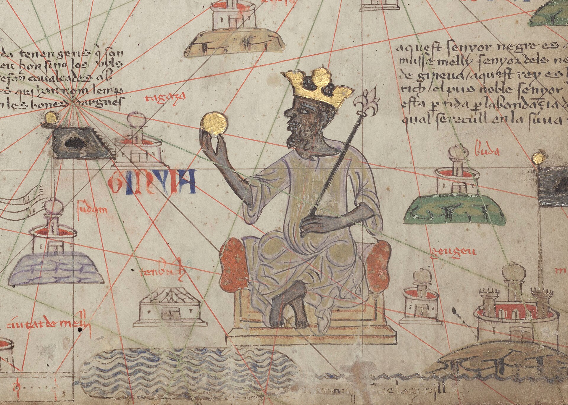
Figure 17.1. Mansa Musa in the Catalan Atlas, 1375, attributed to Abraham Cresques. The image places a powerful West African ruler and the wealth of Mali within a medieval cartographic world centuries before the colonial partition of Africa. Bibliothèque nationale de France, Département des manuscrits, Espagnol 30. Public domain.
On 4 September 2026, the United Nations General Assembly found itself debating a map projection. Togo had introduced the issue on behalf of the African Group, and the resolution before delegates carried an unusually direct message: the familiar visual proportions of the world map did not represent land area fairly, particularly for Africa. The final institutional story belongs near the end of this book, where the resolution, the vote and its practical consequences are examined in detail. What matters here is the historical question behind that moment. How did the apparent size of one continent become a subject of diplomacy, and why did a mathematical choice made in the sixteenth century become entangled with arguments about empire, representation and political power nearly five hundred years later?
The starting point is simple. Africa covers a little over 30 million square kilometres and Greenland a little over 2 million, making Africa roughly fourteen times larger.[1] On a Mercator world map Greenland can look remotely comparable. As Chapter 2 explained, this is a latitude effect: Mercator progressively enlarges higher latitudes rather than applying a special shrinking rule to Africa.[2] The later political question is what happened when that visual consequence met Africa’s political history.
Africa’s cartographic history did not begin with Mercator, and it certainly did not begin with the Scramble for Africa. Long before nineteenth-century partition, maps made around the Mediterranean and beyond contained information about African kingdoms, trade routes, cities and rulers.[3] The fourteenth-century Catalan Atlas famously depicted Mansa Musa of Mali holding a gold object, while the fifteenth-century Fra Mauro map represented an Africa dense with names, routes and reported places. These were not neutral or complete portraits of the continent, and they were produced outside the African societies they depicted. They were filtered through the knowledge, conventions and interests of their makers. Their value here is simpler: Africa was already part of a wide geography of states, commerce, travel and political imagination centuries before European colonial partition.


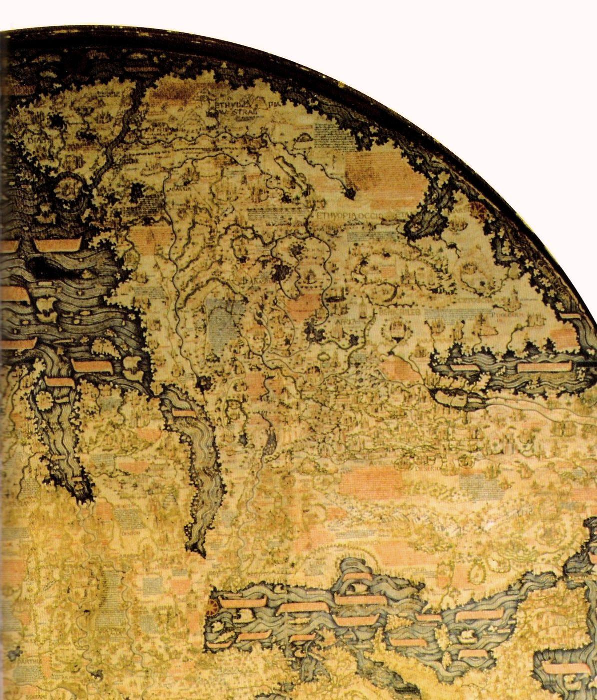
Figure 17.2. Africa in the Fra Mauro world map, c.1450. The continent is dense with names, reported places and routes, a reminder that Africa's cartographic history long predates nineteenth-century colonial partition. Fra Mauro / Biblioteca Nazionale Marciana, Venice. Public domain.
The relationship between Africa, mapping and power is therefore much older and better documented than any theory about Mercator causing colonial attitudes. European colonial states later used maps directly as instruments of exploration, negotiation, military planning, administration, resource extraction and territorial control. They did not arrive with complete geographic knowledge and impose it on a blank continent. Explorers, officials and mapmakers repeatedly depended on African guides, interpreters, political authorities and local knowledge.[4] Rivers, routes, settlements, kingdoms and environmental conditions were already known by the people who lived among them. What changed was the growing institutional power of European states to select, translate and circulate geographic knowledge in forms that acquired administrative and diplomatic force.
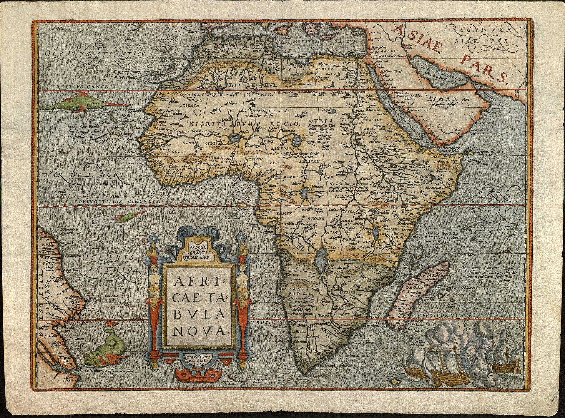
Figure 17.3. Abraham Ortelius's Africae Tabula Nova, 1570. Published in the first edition of Theatrum Orbis Terrarum, it shows the early-modern European atlas tradition taking shape long before nineteenth-century colonial partition. Abraham Ortelius / University of Texas at Arlington Libraries. Public domain.
A place could appear blank on one map while being deeply known to the people living there. In nineteenth-century Africa, expanding colonial institutions gained an increasing ability to turn incomplete knowledge into political claims. Military reconnaissance, surveying, printing, treaties and bureaucratic records made it possible to administer territory from a distance. Roads and rivers became networks, mineral areas became concessions, administrative districts acquired names and colours, and a claim could appear far more complete on paper than control actually was on the ground.
Few episodes symbolise this relationship more strongly than the Scramble for Africa, and few have acquired a more misleading cartographic shorthand. The familiar story imagines the Berlin Conference of 1884 and 1885 as the moment when European leaders spread a map across a table, took out rulers and divided Africa into the borders that still exist today. The image captures something real about imperial power: African sovereignty was frequently ignored, European competition drove the partition and communities were incorporated into colonial territories without their consent.[5] Yet as a description of how the continent’s actual borders were formed, the image is too simple.
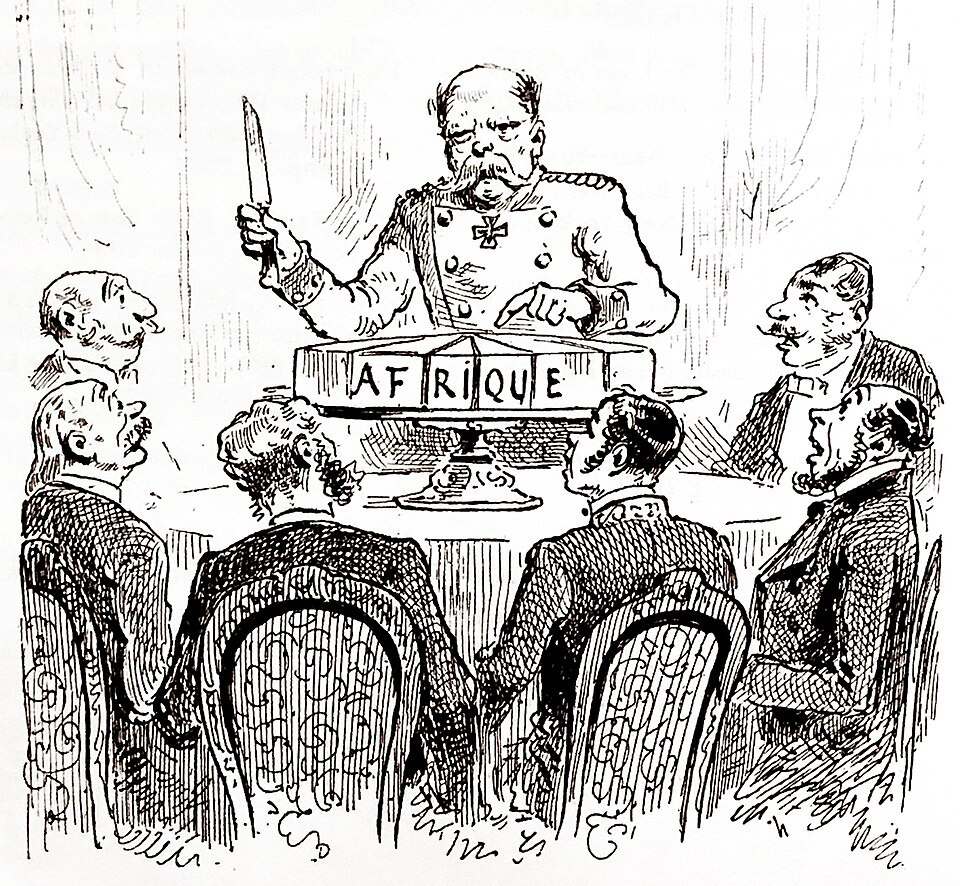
Figure 17.4. An anonymous political cartoon published in L'Illustration on 3 January 1885 depicts Otto von Bismarck cutting an 'Africa' cake while other delegates watch. It is a contemporary satirical image of the Berlin Conference, not a literal record of the negotiations. Public domain.
Recent systematic research by Jack Paine, Xiaoyan Qiu and Joan Ricart-Huguet examined the formation of 107 bilateral colonial borders in Africa and found that most were not fixed at Berlin.[6] The median year of initial border formation in their dataset was 1891, with major revisions continuing later. Their analysis also found that precolonial political frontiers directly influenced many boundaries, alongside rivers, lakes, topography, settlement patterns and the practical information colonial states acquired after the Berlin Conference. Straight geometric lines were important, particularly in sparsely populated or poorly known regions, but the detailed partition emerged through decades of treaties, bargaining, military expansion, surveys, local knowledge and revision.
This correction makes the process more historically useful without making colonial border-making benign. Power rarely becomes geography in one dramatic act. A government announces a claim, diplomats negotiate, surveyors locate features, administrators gather information, local rulers bargain or resist, soldiers enforce decisions and maps are revised as control changes. The line eventually becomes difficult to move because institutions accumulate around it. Roads lead to border posts, administrative districts are organised around it, legal systems recognise it and successive maps reproduce it. The apparent certainty of the finished boundary hides the years of negotiation and coercion through which it became certain.
Colonial maps could therefore function both as records of control and as instruments for creating it. An atlas coloured a territory as British, French, German, Belgian, Portuguese or Italian even when colonial administration remained thin across large areas. The colour translated a claim into a visual fact for audiences in Europe and elsewhere. Over time, the claim was followed by surveying, taxation, transport systems, district administration and military force. Mapping was one component of the machinery through which empire became organised and legible.
The end of formal colonial rule introduced one of the great paradoxes of African political geography. Newly independent states inherited boundaries associated with European imperial competition, yet most chose to defend those boundaries rather than reopen the entire territorial settlement. The reasons were practical as well as political. Precolonial kingdoms had expanded and contracted, communities overlapped, languages crossed frontiers and many different historical criteria could be invoked to justify different maps. Redrawing the continent according to ethnicity, historical kingdom, language or precolonial political authority would not have produced one obvious answer. It could instead have generated widespread territorial conflict.
The Organisation of African Unity confronted this problem directly in 1964. At its first ordinary Assembly of Heads of State and Government in Cairo, member states adopted a resolution on border disputes that committed them to respect the borders existing at the time they achieved national independence.[7] That decision is often described as the principle of uti possidetis in the African context, although the political logic mattered more than the Latin terminology: inherited borders might be deeply imperfect, but reopening all of them could be far more dangerous.
The result is a useful warning against assigning a permanent ideology to a line on a map. A boundary created through colonial bargaining can later become the internationally defended boundary of an independent African state. The coordinates may remain similar while the political authority behind them changes completely. Maps inherit histories, but they do not dictate one meaning forever. The same is true of Mercator. A projection created for sixteenth-century navigation could later become a classroom convention, then a symbol in arguments about colonial representation, and eventually a target of African diplomatic action.
The modern political argument about the apparent size of Africa began long before 2026. In the 1970s, German historian and filmmaker Arno Peters promoted a cylindrical equal-area world map as an ethical alternative to Mercator. His argument travelled well beyond professional cartography because the visual contrast was immediate. Africa and South America occupied far more of the sheet, while Greenland, Canada, Europe and Russia lost much of the high-latitude enlargement familiar from Mercator. Development organisations, churches, educators and campaigners adopted the map because it gave a simple visual form to a much larger argument about representation.
Professional cartographers objected to parts of Peters’ historical and technical case. The projection was essentially the same as one described by James Gall in the nineteenth century, so claims of novelty were disputed.[8] More importantly, equal area did not mean no distortion. Gall-Peters preserves relative area but stretches and compresses shapes conspicuously. Many cartographers were not defending Mercator as a universal world map; they were rejecting the idea that one equal-area projection was uniquely truthful or morally correct.


The Peters dispute became one of cartography’s best-known public arguments because the two sides were often answering different questions. Cartographers focused on projection properties, history and design quality. Campaigners focused on what a familiar world map appeared to say about the relative scale of the Global North and Global South. Technical expertise could explain the distortion perfectly, but it could not make the political interpretation disappear once the public had learned to see it.
For maps comparing territory, an equal-area projection is simply better suited than Mercator. Maps of forest cover, agriculture, population or territorial extent can mislead if high-latitude regions receive far more display area than their geographic area warrants. Equal-area projections preserve the relationship that matters for those tasks.
Peters also exposed a design problem. A map does not become a successful general-purpose world map merely because one mathematical property is appropriate. People notice shape. Gall-Peters preserved area but changed familiar continental forms so strongly that many readers disliked it. The political critique had found a wide audience, but its best-known proposed replacement had not become an obvious visual standard.
In 2018, Bojan Šavrič, Tom Patterson and Bernhard Jenny introduced Equal Earth, an equal-area projection intended to combine correct relative area with a more balanced general-world appearance than Gall-Peters.[9] By the time the political campaign arrived, the design was already implemented in mainstream geospatial software and a Greenwich-centred WGS 84 definition had been registered as EPSG:8857. That chronology matters: African diplomacy did not invent the projection or the CRS. It selected an existing, technically deployable alternative for a political campaign about world-map representation.
By the time African advocates began pushing for Equal Earth, the technical alternative was therefore mature. In April 2025, Africa No Filter and Speak Up Africa launched the Correct the Map campaign.[10] Their message was intentionally direct: the familiar Mercator world map made Africa appear much smaller relative to northern regions than it really was, and institutions should adopt equal-area alternatives such as Equal Earth in contexts where area representation mattered. The campaign framed this as part of a broader problem of African representation, linking cartographic proportions to questions of narrative power and inherited global conventions.
The campaign’s political language went beyond what projection mathematics alone can prove. It is straightforward to demonstrate that Mercator inflates high-latitude area and that Equal Earth preserves relative area. It is much harder to demonstrate exactly how repeated exposure to a particular projection affects political judgement, self-perception or attitudes towards a continent. That psychological step requires empirical evidence of its own, so the levels must remain separate here. The campaign’s larger claims should be attributed as political arguments rather than presented as consequences proved by geometry.
That caution does not reduce the political significance of what happened next. African organisations had taken a technical property of map projections and turned it into a question of continental representation. More importantly, the issue moved from civil-society advocacy into African state diplomacy. Togo became the central government actor, and the campaign increasingly connected with African Union debates over historical justice, representation and what officials described as narrative sovereignty.
At the African Union’s 39th Ordinary Session on 14 and 15 February 2026, leaders adopted the Equal Earth projection and urged member states to revise national curricula in accordance with it.[11] The decision, proposed by Togo, transformed Correct the Map from a campaign into an intergovernmental African position and provided for a champion to promote the initiative with the African Union Commission. Togo then carried the proposal into the wider international system, and by April Foreign Minister Robert Dussey was publicly confirming that the country intended to seek support at the United Nations.[12]
There is an important historical reversal in this sequence. In the 1970s, Arno Peters was a European telling audiences that Africa and the developing world were misrepresented by conventional maps. In 2026, African organisations and African governments were defining the issue themselves, deciding how to frame it and choosing the diplomatic institutions through which to pursue it. Whatever one thinks of the campaign’s broader rhetoric, that change in authorship matters. The argument was no longer simply about outsiders deciding how Africa ought to appear. African states were asserting their own preference about the representation of the continent within global cartography.
Togo’s leadership also demonstrates a form of power that is easy to miss in a book dominated by large states and famous empires. A comparatively small country can sometimes exercise disproportionate diplomatic influence by choosing an issue that is easy to understand, symbolically strong and technically difficult to refute. The area comparison between Africa and Greenland can be shown in seconds. Equal Earth already existed. The African Union provided institutional support. The proposed change did not require renegotiating a border, transferring money or surrendering sovereignty. It asked governments to support a different default for particular kinds of maps.
That made the issue politically efficient. A government supporting the campaign could present its vote as backing geographic accuracy, African representation and a modest modernisation of mapping practice. A government opposing it had to explain why. The underlying geometry placed critics in an awkward position because nobody could plausibly argue that Greenland actually deserved almost as much visual area as Africa on a map intended to compare territorial size. Opposition therefore centred not on the mathematics but on whether the United Nations should turn a projection choice into a political programme.
The United States ultimately made that argument. At the General Assembly, its representative objected to the ideological framing of the initiative and argued that the organisation had more pressing responsibilities. That position deserves to be stated fairly. It was not a declaration that Africa ought to look small. It was an argument that the UN should be cautious about treating a technical cartographic choice as part of a programme of historical or representational justice. The African position was equally clear: inherited conventions are not neutral simply because they are familiar, and a general world map that misrepresents relative area has no special claim to remain the default when an appropriate alternative exists.
On 4 September, the General Assembly adopted the resolution overwhelmingly.[13] Projection choice had moved from specialist cartography into international diplomacy.
For Africa, the most durable achievement is narrower than some of the campaign rhetoric. A world map intended to represent relative continental area no longer needs to reproduce the familiar Mercator imbalance. Equal Earth and other equal-area projections make Africa’s share of global land area visible without requiring the conspicuous shape distortions associated with Gall-Peters. A school, news organisation or international institution can make that choice for straightforward cartographic reasons before entering any argument about psychology or symbolism.
That achievement should remain separate from the history of colonial conquest.[14] European empires did not conquer Africa because Mercator made Europe look large. Colonial states used maps much more directly, to claim, survey, administer, tax, transport, extract and govern. Their boundaries emerged through unequal political and military relationships, though not through the simple ruler-at-Berlin story so often repeated. After independence, African states inherited many of those lines and deliberately stabilised them. The 2026 campaign addressed a different cartographic inheritance: not where Africa’s borders were, but how much visual space the continent occupied when the world was flattened onto a page.
Changing that visual space cannot undo the earlier history. Equal Earth does not repair colonial borders, settle conflicts or redistribute power. It does one measurable thing well: it preserves relative area. Its political significance comes from the fact that African organisations and governments decided that this measurable property was worth making visible, then built enough diplomatic support to turn that preference into a United Nations resolution.
The route to the vote is what makes the story more than a dispute over graphic design. An existing equal-area alternative moved from software into civil-society advocacy, then through Togo into African Union diplomacy and finally the United Nations. The mathematics did not change during that journey. The authority surrounding the map did.
The result was not the defeat of Mercator. It was a shift in what could pass without explanation. Once equal-area alternatives are readily available, using a Mercator world map for continental size comparison becomes an active design choice rather than an inherited inevitability.
That theme links Africa back to the Indigenous mapping of the previous chapter. A map acquires power when institutions treat its representation as authoritative, whether the issue is a survey boundary, a place name, a customary territory or the apparent area of a continent. In each case, the political question begins when one representation becomes normal enough to disappear from view as a choice. The contemporary shift is not that maps have suddenly become political. It is that more people are recognising where the choices are and claiming a role in making them.
Africa’s measured area never changed. What changed was the willingness of institutions to question a familiar picture of the world. Greenland is the obvious counterpoint: correcting Mercator reduces its visual size beside Africa, but not its geopolitical importance.