CHAPTER 15
THE PLACE THE WEB MAP CANNOT SHOW
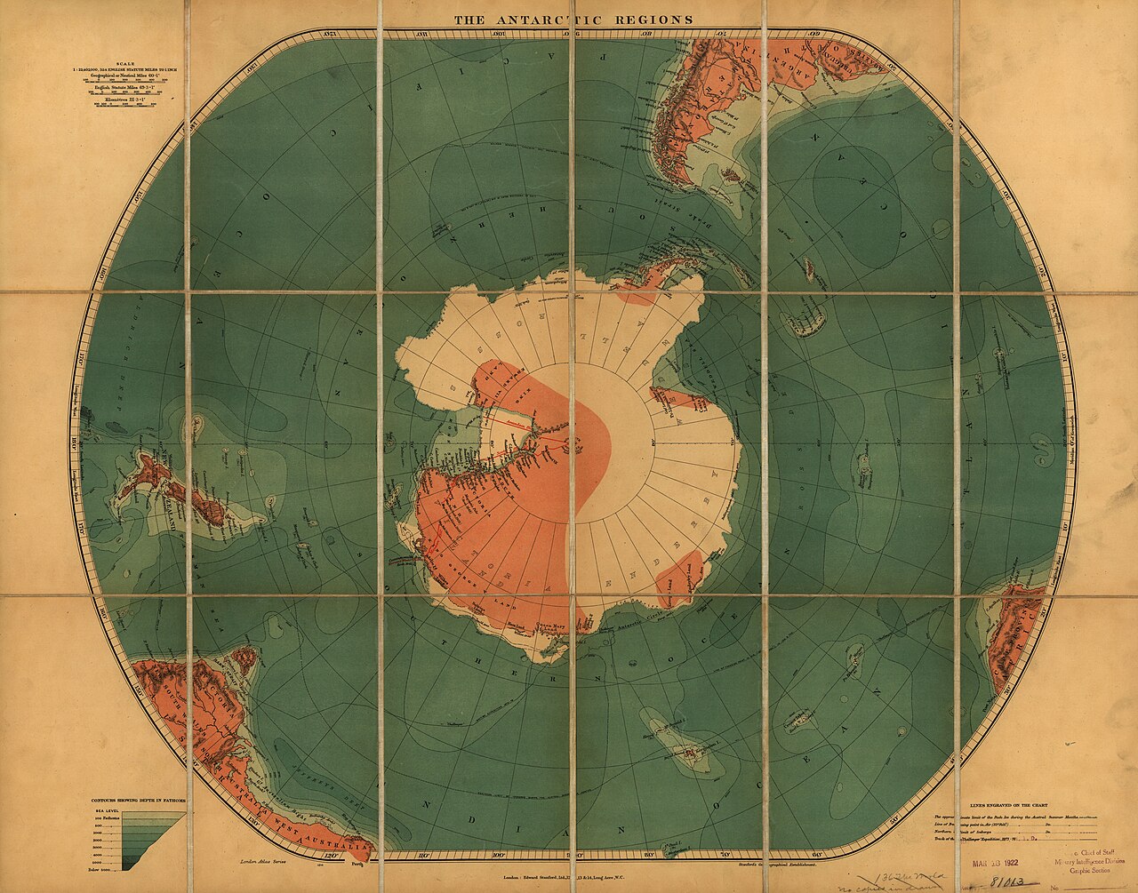
Figure 15.1. The Antarctic Regions, Edward Stanford Ltd., c.1900. The South Polar view makes Antarctica a coherent centre rather than the unreachable edge of a cylindrical world map. Library of Congress, Geography and Map Division. Free to use and reuse.
Open a familiar web map and begin dragging south.
At first, nothing seems unusual. New Zealand slides upward. The Southern Ocean expands. Antarctica approaches. Coastlines redraw, labels appear and imagery sharpens. The interface gives every impression that the world will continue indefinitely beneath the cursor.
Then, at about 85 degrees south, the map stops.
Not the Earth. The map.
In the Web Mercator coordinate system used by much of the modern web, the standard square world ends at about 85.0511 degrees north and south. The South Pole lies roughly five degrees farther on. It still supports ice, instruments, scientists, buildings, vehicles, survey marks and decades of geographic data. But it does not fit inside the ordinary Web Mercator tile world.
That is a strange discovery in a technology that feels universal.
The explanation comes directly from the projection. Mercator stretches latitude more and more as it approaches the poles. At ninety degrees the projected coordinate runs to infinity. The pole is not merely distorted. It cannot be placed at a finite distance on a true Mercator plane.
The web needed a finite world, so engineers clipped it. The familiar limit near 85.0511 degrees is the latitude that makes the projected world fit into a square suitable for the tile pyramid described in the previous chapter.[1] The same decision that made the global slippy map neat, cacheable and interoperable removed the poles from its planar coordinate world.[2]
That engineering bargain is elegant from a computer’s perspective and an awkward frame from Antarctica.
Antarctica is not an expendable white margin. It covers roughly fourteen million square kilometres, depending on how ice shelves and islands are counted. It contains the geographic South Pole, mountain ranges, volcanoes, research stations, protected areas, traverse routes and one of Earth’s most closely studied climate systems. New Zealand has maintained a permanent scientific presence there since Scott Base opened in 1957.
Antarctic scientists do not wait for Web Mercator to become more accommodating. A major modern answer is Antarctic Polar Stereographic, EPSG:3031.[3] It places the South Pole directly on the plane and arranges the continent around it. Longitudes radiate outwards. The geography that appeared as a stretched strip along the bottom of a rectangular world map becomes a coherent working region.
This is projection choice in its most practical form. The British Antarctic Survey’s Antarctic Digital Database uses Antarctic Polar Stereographic for operational geographic data.[4] Coastline, rock outcrops, ice features and other layers are not being arranged that way to make a philosophical statement about world maps. They are being arranged so scientists and mapmakers can work with Antarctica as Antarctica.
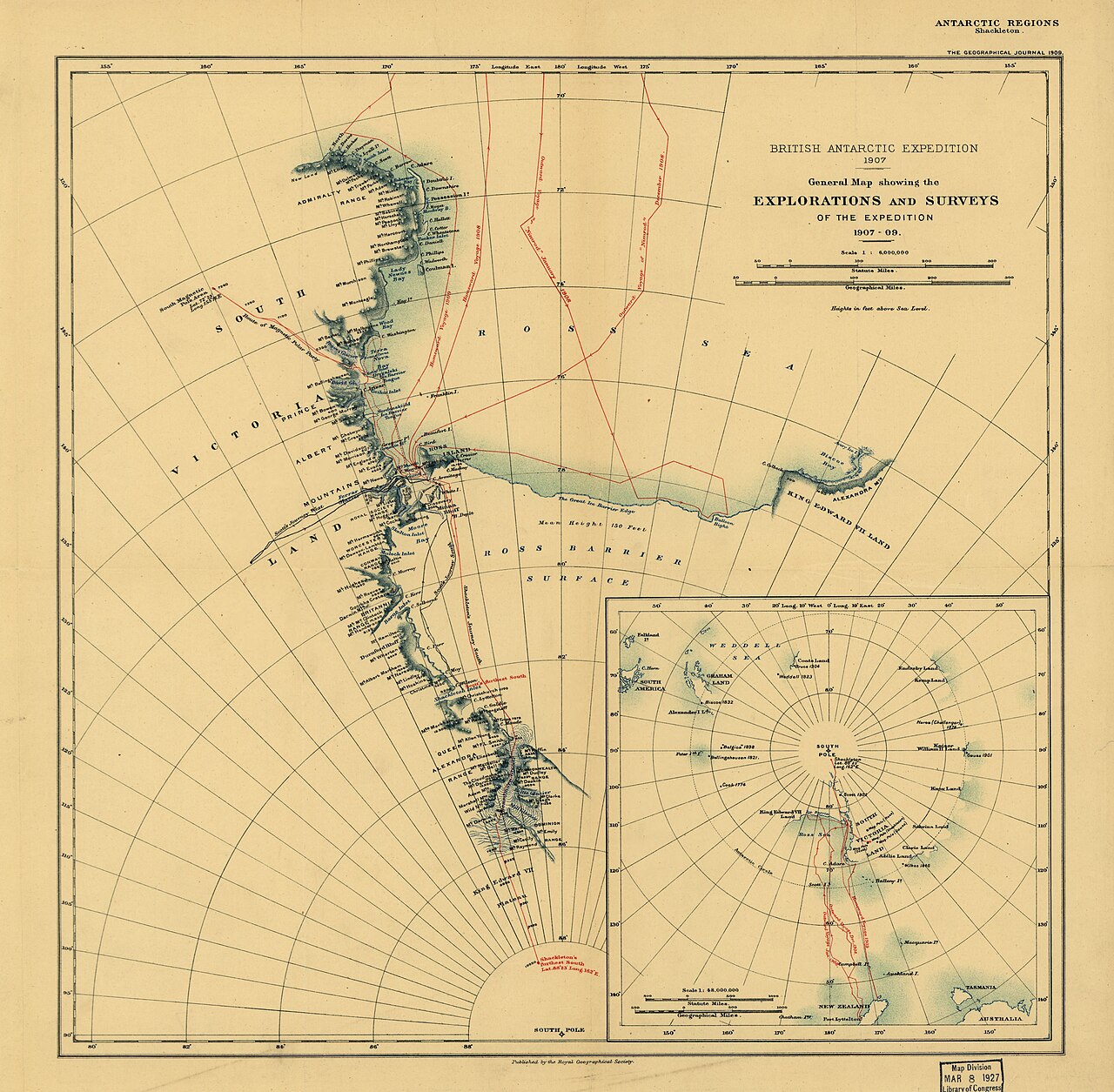
Figure 15.2. General map of Ernest Shackleton's Antarctic expedition and surveys, 1907–09. Long before digital polar databases, Antarctic exploration already demanded maps that treated the continent as a coherent working geography. Ernest Shackleton / Library of Congress. Public domain.
The map changes because the job changes. A world map needs to show the relationship of the entire planet at once. An Antarctic research map needs to make the pole, ice sheet, coast and surrounding ocean usable. A logistics map between Christchurch and Scott Base may need yet another treatment because its question is not how to map all Antarctica, but how to show a long regional connection across the Southern Ocean.
Antarctic mapping makes the point concrete: EPSG:3031 exists because polar work requires different geometry.[5][6]
The South Pole also exposes a visual habit created by rectangular world maps. Antarctica often appears as a long white band across the bottom of the page. Every longitude meets at the pole, yet a cylindrical map has to spread those meridians across a horizontal edge. The continent can therefore look less like a place than like the map’s lower border.
Turn to a polar map and the relationship changes immediately. The coast becomes a recognisable form around the centre. The Ross Sea, Weddell Sea and Antarctic Peninsula occupy positions that are easier to compare. The Southern Ocean circles the continent rather than falling apart along the bottom edge. New Zealand’s route south becomes part of a southern geographic system rather than a journey towards the bottom of a rectangle.
The polar view makes the subject legible on its own terms.
For Aotearoa, that matters. A standard Greenwich-centred world map often places New Zealand near the lower-right margin. A polar view reveals another geography. Christchurch is one of the main gateways to Antarctica. The Ross Sea is not beyond the bottom of the world. It lies south of New Zealand across an ocean connected by science, weather, logistics and history.
A 1922 map of the south polar regions held by the National Library of New Zealand already understood the principle. Long before EPSG identifiers and tile matrices, mapmakers recognised that polar geography demanded a different geometry.
Digital mapping added invisibility. A printed map usually announces its frame simply by existing as a sheet. The edge is obvious. A web map encourages the opposite sensation. Dragging feels continuous. Zooming feels limitless. The projection disappears beneath the interface.
The 85-degree cutoff is therefore more interesting than it first appears. It is where a hidden default becomes visible.
Web Mercator’s inability to include the poles belongs to the same mathematical structure that made it convenient for the tiled web. It succeeds spectacularly at a rectangular, global, zoomable interface across most inhabited latitudes. Antarctica asks another question and therefore needs another geometry.
Digital mapping makes this flexibility easier than paper ever could. A platform can retain existing services while changing the display for another scale or specialist task. Antarctica makes the point obvious: a specialist polar system can be the correct answer to a specialist polar problem without becoming a prescription for every other map.
The South Pole makes the distinction impossible to miss: in Web Mercator it is mathematically unreachable, while in Antarctic Polar Stereographic it can sit at the centre.
At the pole, the hidden assumptions of a universal-looking web map become visible. A deeper question sits underneath them: who gets to define geography, names and evidence before any projection is chosen?