CHAPTER 8
THE MAP GOES TO WAR
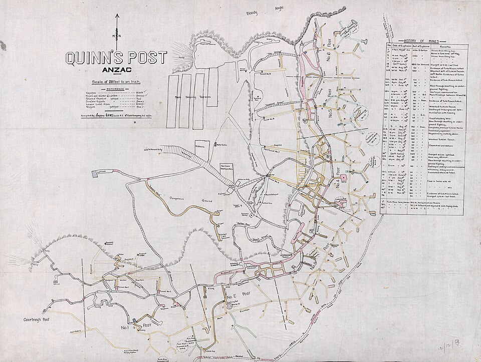
Figure 8.1. Quinn's Post trench and tunnel map, Gallipoli, December 1915. Made by Sapper (later Lieutenant) Ronald McInnis. The dense network of trenches, saps and tunnels shows the operational scale at which wartime mapping could become a matter of survival. Australian War Memorial, G7432.G1 S65 XII.8e. Public domain.
At a scale of 1:1,800, one centimetre on a map represents eighteen metres on the ground.[1]
A surviving New Zealand Expeditionary Force plan from Gallipoli is drawn at exactly that scale. It shows the Apex on Rhododendron Spur below Chunuk Bair. The sheet, about forty-one by fifty-six centimetres, is almost obsessively local. It has no interest in explaining the Ottoman Empire or why armies had landed on the peninsula. It is interested in a patch of steep ground where a few dozen metres could matter.
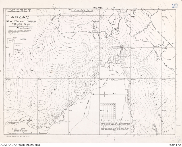
Figure 8.2. ANZAC New Zealand Division trench plan of The Apex, Gallipoli, 1915, scale 1:1,800. Made by the Printing Section, G.H.Q., Mediterranean Expeditionary Force. The map is almost obsessively local because a few dozen metres could matter. Australian War Memorial, RC04172. Copyright expired, public domain.
The plan survives in Auckland Libraries as one sheet in a 1915 ANZAC New Zealand Division trench-plan series.[2] Its value is broader than the provenance of any one surviving copy. It shows the cartographic environment in which New Zealand troops fought: an army enlarging small pieces of landscape because operational consequences had become concentrated inside them.
At the Apex in the early hours of 7 August 1915, Lieutenant-Colonel William Malone and the Wellington Infantry Battalion were living inside that kind of geography.[3]
The Allied August offensive was intended to break the stalemate at Anzac by seizing the heights of the Sari Bair Range, including Chunuk Bair. The ground between the beachhead and the summit was a maze of steep ravines, narrow spurs and scrub. Soldiers had given working names to places that now carried military meaning: Old No. 3 Post, Table Top, Rhododendron Spur, the Apex, the Pinnacle and Chunuk Bair.
The plan depended on units moving through that terrain at night and arriving at particular places on schedule. The terrain did not cooperate. Columns became lost or delayed, rendezvous failed and the offensive lost precious hours while Ottoman forces reinforced the heights. A route can be intelligible on a map and still be brutal to follow in darkness through unfamiliar ground.
Malone reached the Apex with the Wellington Battalion. After the Auckland Battalion suffered heavily in a daylight attack on 7 August, Malone resisted sending his men forward in the same conditions. The Wellingtons attacked before dawn on 8 August and reached Chunuk Bair, where they occupied and extended trenches under intense fire.[4] By the time the battalion was relieved that evening, about seventy of the 760 men who had advanced from the Apex were still standing. Malone was dead, killed at about 5 p.m. by an Allied shell, probably from supporting artillery.
The event contains a terrible lesson about increasingly precise warfare. Maps, grids and fire-control systems were intended to put violence in the intended place. Greater positional precision made coordination possible on a scale earlier armies could not manage. It also made errors of tens of metres consequential in ways that errors of kilometres were not.
The 1:1,800 Apex plan makes the scale visible. Five centimetres on the paper is ninety metres on the ground. A tiny movement of pencil or a slight misunderstanding of position can represent the distance between a trench and supporting fire.
This is where cartographic language becomes counter-intuitive. A 1:1,800 plan is a large-scale map because the fraction is large and the map shows a small area in great detail. A world map is small scale. Soldiers did not need the terminology to understand the practical difference. A world map could explain why armies were fighting across continents. A trench map helped determine which gully, junction or trench mattered next.
The First World War turned local precision into an industrial mapping system. The British military produced tens of millions of official maps, including an immense family of Western Front sheets at different scales. The National Archives describes 1:40,000 maps used for wider administrative purposes, 1:20,000 maps important for artillery, 1:10,000 trench maps for local operations, and 1:5,000 sheets for even more detailed work.[5]
This was cartography organised by consequence. Different jobs required different extents and detail.[6] The battlefield did not have one definitive scale any more than the world has one definitive projection.
The Western Front also developed a grid-reference language that let positions travel through messages. A location could be compressed into letters and numbers and passed among headquarters, observers, artillery and infantry. A grid reference might identify a square and then subdivide it to increasing precision. Add enough detail and a location could be narrowed to only a few yards.
A place no longer needed a memorable name before it could become operationally important; it could be a coordinate. The usefulness depended on a shared system. A grid reference without the correct sheet is nearly useless. Modern researchers still encounter wartime diaries containing coordinates whose meaning has to be reconstructed from the map series the writer was using. The number belongs to a reference system, not to the landscape by itself.
That idea will matter later when this book reaches modern geodesy and GIS. For the battlefield, the immediate point is simpler: standard grids made position portable.


They also made currency important. Trenches moved. New positions were dug, batteries shifted and intelligence changed. The National Archives catalogue repeatedly records sheets with trenches “corrected to” a particular date. A beautifully printed map could become operationally stale while remaining perfectly legible.
A military user therefore needed the right place at the right scale and the right date. Security followed naturally. A map useful to your own army can help the enemy if captured. Larger-scale trench maps often emphasised enemy positions, while “Secret” editions could show Allied trenches as well. Operational users wanted detail; security officers wanted control; cartographers wanted consistent symbols; intelligence officers wanted the latest positions. One sheet could not serve every requirement.
Armies therefore produce families of maps. The New Zealand Apex plan belonged to one family of local operational sheets. Broader maps explained the Sari Bair offensive. Artillery grids, naval charts, aerial photographs and sketch maps answered other questions. Later official histories would draw the same ground again for readers who already knew how the battle ended.
That last category carries a trap. A clean retrospective map can make a battle look more coherent than it felt to the people inside it. Arrows move decisively, units have tidy labels and objectives sit still. A battalion commander in a gully did not possess the historian’s complete aerial view. Reports arrived late, units were missing, terrain blocked sight and darkness erased landmarks.
Gallipoli reminds us that a map extends what people can know without turning them into omniscient observers. The plan had geometry. The men had geometry plus fatigue, uncertainty, enemy action and a clock.
After the fighting, the same ground changed cartographic jobs. In 1916, New Zealand’s Department of Lands and Survey included a “Map of Anzac” in its annual report. The department said the map was prepared from information supplied by Private Waldo Thompson, a member of its Napier staff who had landed on 25 April 1915 and served for four months.
The episode creates a small loop in New Zealand’s mapping history. A civilian survey employee went to war, returned with knowledge of a battlefield, and his department helped turn that knowledge into a map for readers at home.
The annual report tried to make the scale of Anzac understandable. It put the occupied area at about 1,000 acres, with the sea front extending about three miles and only about 1,100 yards between the sea and front trenches at the widest point. The campaign occupies a huge place in New Zealand memory. The actual Anzac position occupied a remarkably compressed piece of ground.
The 1916 map was no longer helping somebody attack a trench. The troops had withdrawn. Its job was explanation, record and memory. The same landscape had moved from operational geography into national history.
Maps of war often keep moving after the shooting stops. They become archival evidence, archaeological guides and clues for families and historians. Old grid references are decoded. Trench positions are compared with modern landscapes. A wartime sheet can become more historically valuable as its operational value disappears.
The First World War did not invent military cartography, but it demonstrated the scale at which mapping could become woven into everyday operations: millions of sheets, standard grids, multiple scales, frequent revisions and security classifications. Paper had become part of an information system.
Some lines outlasted the operations that created them. A trench line might vanish into archaeology, while a ceasefire line could remain on the map and accumulate patrols, checkpoints, rules and institutions around it.