CHAPTER 3
WHEN THE USEFUL MAP BECAME THE WORLD
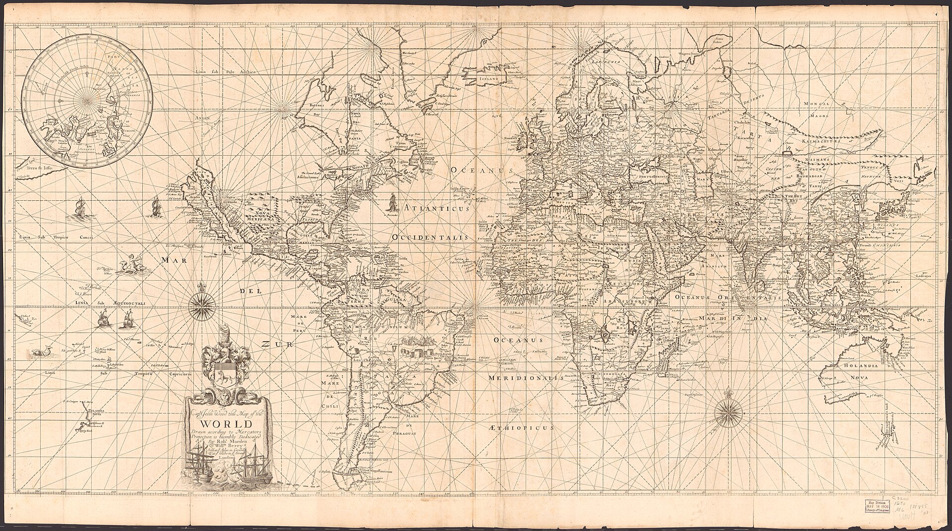
Figure 3.1. Robert Morden and William Berry's world map on Mercator's projection, c.1690. Rich decoration and general-world presentation show the projection moving beyond a specialist navigational solution into wider cartographic culture. Library of Congress, Geography and Map Division. Public domain.
On 17 January 1871, a Wellington bookseller advertised the equipment of education.[1] There were grammar books, copy books, histories, arithmetic texts, school atlases and wall maps. A teacher could order Europe, Palestine, New Zealand or the whole world. Then, tucked into the list, came a choice that would have sounded peculiar three centuries earlier.
The choices included “World in Hemispheres”, 30 shillings, and “Maps of the World, or Mercator’s Projection”, 25 shillings.
The wording is almost comically ordinary. There is no announcement that one of the great technical inventions in cartography has reached a colony on the far side of the world. No explanation of rhumb lines or conformality accompanies the price. A projection created around a sixteenth-century navigation problem has become something a school can order from the newspaper, for five shillings less than the hemispheres.
The advertisement does not prove that every New Zealand classroom used Mercator. It immediately proves the opposite of that tidy story, because another world map was offered beside it. What it does show is more interesting: by 1871, “Mercator’s Projection” was a recognisable commercial category. The projection had acquired a career independent of its inventor.
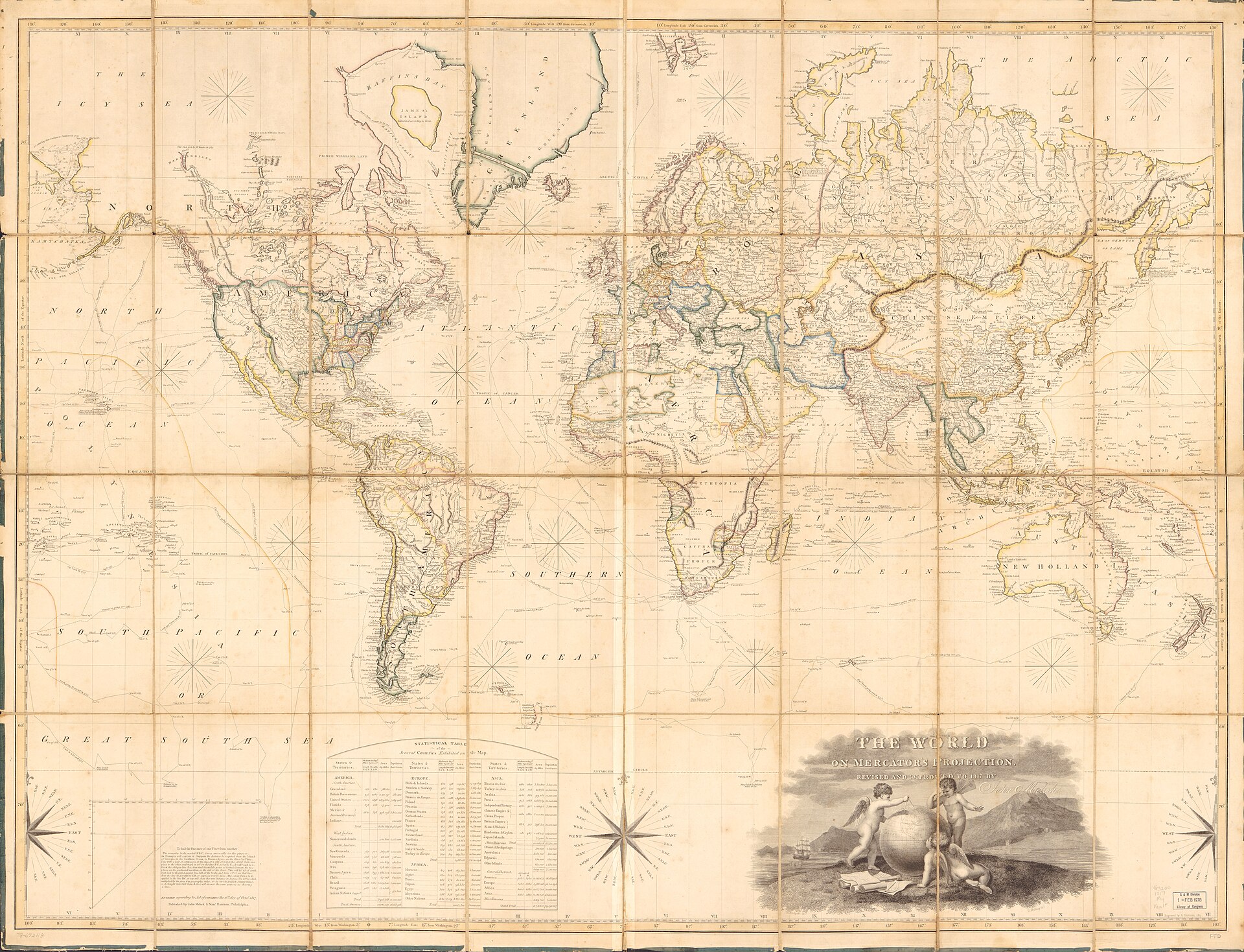
Figure 3.2. The world on Mercator's projection, 1818. Published by John Melish and Samuel Harrison; drawn by Hugh Bridport and engraved by George Murray. By the nineteenth century Mercator had acquired a life far beyond its original navigational problem and had become an ordinary commercial map form. Library of Congress, Geography and Map Division. Free to use and reuse.
That career had been developing for generations. Around 1690, London cartographers Robert Morden and William Berry produced a world map described explicitly as being drawn according to Mercator’s projection. The map still remembered the sea. It was dedicated to Captain John Wood, carried compass roses and rhumb lines, and included a north-polar inset. Yet it also demonstrated that projection and geographic knowledge are different problems. California appeared as an island.
Mercator’s geometry could be reproduced correctly while the information placed inside it remained wrong. A projection transforms positions on a surface. It cannot correct a bad report, an incomplete survey or a fashionable geographical mistake. That distinction matters whenever an old map is judged as though every error visible on it were caused by the projection.
Morden and Berry’s map revealed something else. Gerardus Mercator was no longer required. Once a technique is reproducible, it can detach from the person who created it. Other mapmakers can apply the same projection to new coastlines, new boundaries, new decorative styles and new audiences. The inventor’s surname becomes an adjective, and the method enters the trade.
In 1818, John Melish published a large world map on Mercator’s projection in the United States. It combined geography with practical instructions for finding distance and with statistical information. The projection still had a working life, but the context was widening. It was now a framework into which a commercial mapmaker could pour the changing geographic knowledge of a young republic.
By 1840, the Edinburgh firm A & C Black included The World, on Mercator’s Projection in its General Atlas.[2] The map was modest enough to turn in a book rather than dominate a wall. It belonged to readers at tables, not only navigators at sea.
The geographic content of such maps was still uneven. Coastlines had improved greatly in European cartography, while large continental interiors remained incompletely surveyed or confidently wrong. Antarctica was absent or poorly understood. Arctic geography was incomplete. Political boundaries could be uncertain, and place names reflected the languages and institutions of the people making the maps. The projection supplied a precise grid without guaranteeing that everything inside the grid was equally precise.
By the nineteenth century, Mercator had therefore acquired something more powerful than fame: routine. Publishers knew how to make the maps. Sellers knew how to list them. Readers recognised the format. Institutions could buy replacements from catalogues rather than commission an entirely new cartographic idea.
Routine is a quiet way for standards to spread. Nobody needs to announce that a convention has become normal. People build around what already exists, and what already exists becomes easier to keep using. The mechanism is not unique to maps. It is one of the ways technical choices acquire an institutional life.
That explanation must not become too neat. Mercator did not march from the sea into every atlas and classroom until it conquered the world. Hemisphere maps and globes remained common, regional maps used many projections, and publishers made different choices across places and decades. The Wellington advertisement catches that untidiness in one column: two different representations of the same planet were both for sale.
School records allow us to see what happened after the catalogue. In 1876, an inspection of Awanui School listed a world map on Mercator’s projection among the equipment.[3]
These records belong to the broader history of the Native Schools system and colonial education in Aotearoa. An inventory entry cannot tell us how Māori pupils experienced a map or what a teacher said about it. For the narrower history of cartographic convention, the inventory establishes something concrete: Mercator had become ordinary school equipment.
The same system could also decide that Mercator was the wrong map for a particular room. In 1877, an inspector complained that a Mercator world map was “not suited to the school” and asked for a map of the Pacific instead.[4] The surviving wording does not state whether the objection concerned projection, centring, regional relevance, content or some combination of them. It does establish that a world map could be legitimate in general and still be unsuitable in a Pacific classroom.
Two years later, the judgement was blunter. At Waihou School in 1879 an inspector listed “Mercator’s World (bad)” and requested hemisphere maps.[5] Other Native School inspections that year recorded Mercator maps alongside Europe, Australasia, New Zealand, hemisphere maps and Pacific charts. At Taumarere, the material included a Mercator world map, Europe, New Zealand and a hemispheric map, with further maps including the Pacific requested. At Te Ti, Mercator sat alongside Australasia and New Zealand. The school wall was not organised around one projection. It held an ecology of scales, regions and centres.
The archive becomes even more revealing when teacher examinations are added. In 1880, candidates were asked about the difficulty of representing the spherical Earth on a flat surface and about Mercator’s projection. Similar questions appeared again in 1886 and 1888. The 1888 paper expected candidates to discuss both the projection’s “special advantages” and its “characteristic defects”.[6]
That wording deserves to survive because it is so refreshingly practical. Advantages and defects. The exam did not require the candidate to declare Mercator a triumph or a fraud. It required an understanding that the same geometric design could be useful in one respect and costly in another.
This complicates a popular modern story in which generations of schoolchildren supposedly stared at Mercator without question until recent campaigners finally discovered that the map was distorted. The New Zealand record will not support that. Mercator maps were being sold and used, but their limitations were also being discussed. Teachers could be expected to understand projection trade-offs. Inspectors could ask for another map when the setting demanded it.
Familiarity and criticism can grow together. In 1890, another small piece of evidence shows how far the projection had travelled. A reporter visiting an exhibition of Native School pupils’ work paused at hand-drawn maps. One pupil had drawn a world map on Mercator’s projection, which the reporter praised for its legibility and correctness of drawing.[7]
The colonial setting needs care here as well. The Native Schools system was part of a much larger project of English-language schooling and state policy toward Māori communities. A newspaper reporter’s praise tells us little about the pupil’s own understanding or experience. For the history of maps, the scene establishes something narrower: Mercator had become a teachable form that a pupil could reproduce by hand.
That is a deeper level of circulation than a map hanging on the wall. An object can be seen. A form taught as geography can be recreated by the next generation. The convention begins to live not only in printed sheets but in skills and expectations.
The projection’s journey ran through several kinds of normalisation. Other cartographers reproduced it, publishers put it in atlases, booksellers sold it as school equipment, teachers were examined on its advantages and defects, and pupils learned to draw it. At each stage, the navigational problem of 1569 became less important to the immediate user.
This is how a technical choice becomes cultural scenery. Familiarity can make a particular arrangement feel natural even when alternatives remain available. A rectangular world map can begin to look like the world rather than one way of arranging the world. The distinction disappears not because nobody knows it exists, but because most ordinary uses do not require the user to think about it.
The historical evidence still does not justify saying that Mercator became the single map everyone used. That claim is too strong and obscures the more interesting process. Mercator became one of the most durable and recognisable ways of presenting the whole Earth, while globes, hemisphere maps and many other projections continued alongside it.
The Wellington advertisement captures that better than a slogan can. A school could buy one world for thirty shillings and another for twenty-five. The planet was the same. The presentation was not.
Once a world map becomes ordinary, other choices begin to hide inside it too. Projection is only one. A map must also choose where to place its centre, where to put the edge, how to orient the page and where to begin counting longitude. Those decisions can become familiar enough to look geographical rather than designed.
In 1884, one of them was taken into an international conference room in Washington. Delegates were not deciding which world projection was best. They were deciding where the world should begin counting.