CHAPTER 2
THE SAILOR’S MAP
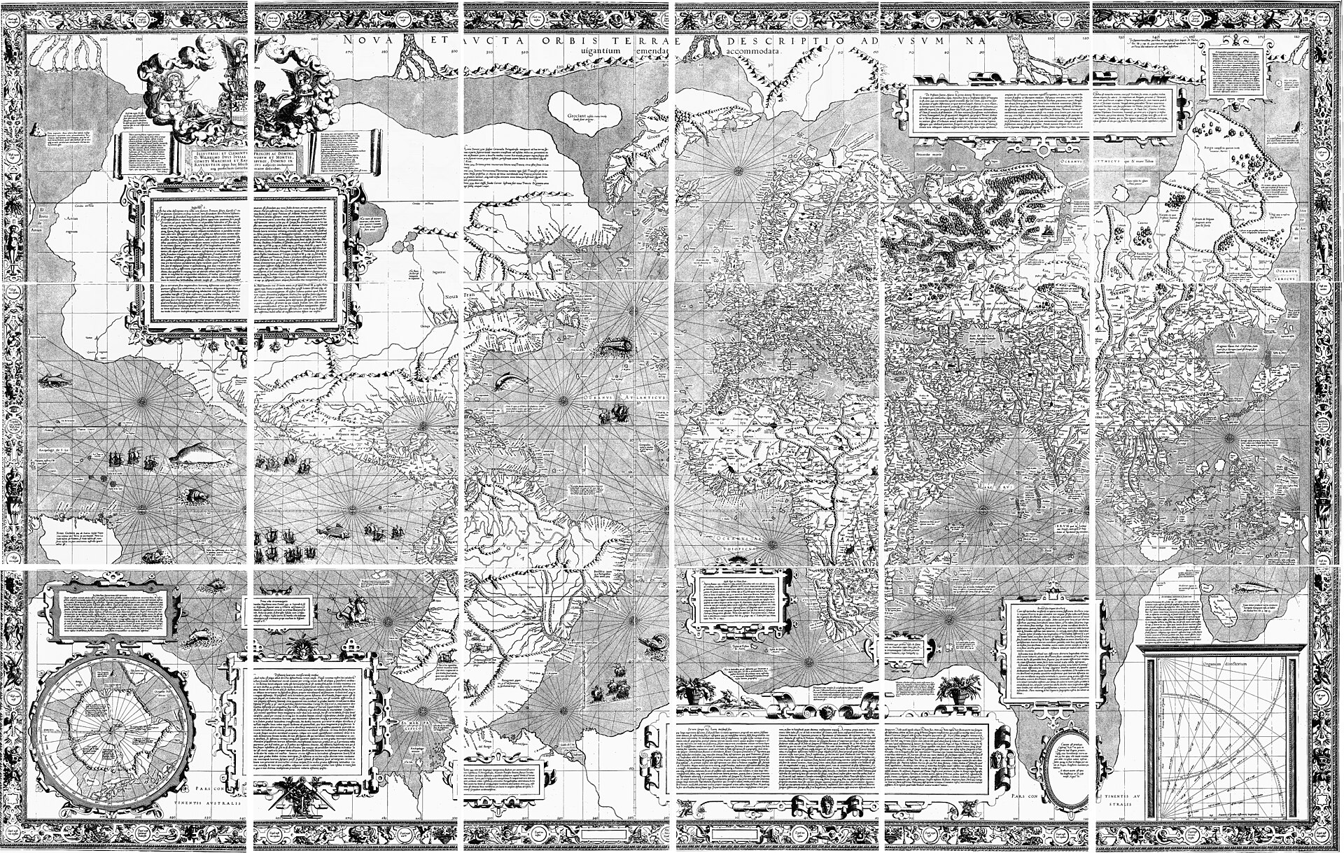
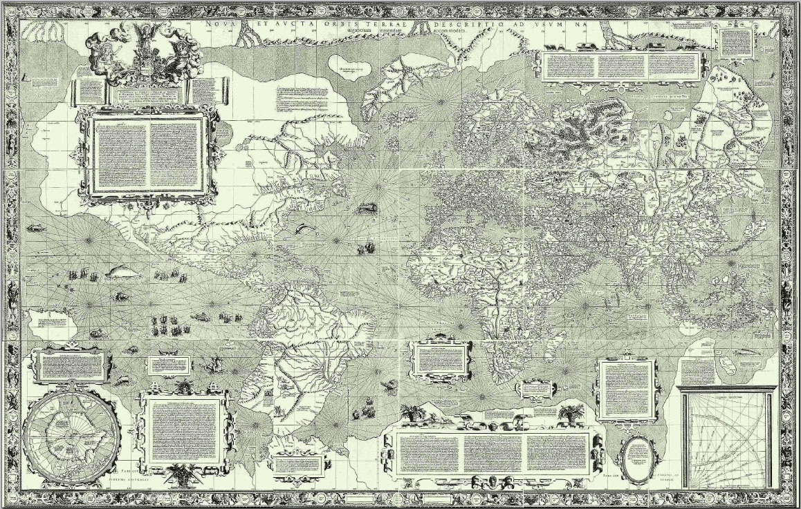
Figure 2.1. Gerardus Mercator's 1569 world map. The projection was designed so that a constant compass bearing could be represented as a straight line, an ingenious solution to a real navigational problem. Gerardus Mercator, 1569. Public domain.
In August 1569, Gerardus Mercator published a world map that was difficult to ignore.[1] Assembled from eighteen printed sheets, it measured roughly two metres across and more than a metre high. Coastlines, place names, notes and geometry crowded its surface. It was less a convenient atlas page than an object capable of taking command of a wall.
The best clue to what Mercator was trying to do was in the title. The map was made for navigation.[2]
That fact is easy to lose because Mercator’s name now belongs to arguments he could not have imagined. It appears in debates about Africa, Greenland, classrooms and online maps. In 1569, however, the problem was much more practical. A sailor had a compass. The Earth was round. The chart was flat. Those facts did not cooperate neatly.
Mariners already possessed charts crossed by directional lines, and they had generations of accumulated practical knowledge about coastlines, winds, currents, stars and compass bearings. None of this made navigation easy. Longitude at sea remained difficult. Magnetic variation could make the compass less obedient than its clean dial suggested. A ship could be pushed off course by weather and current. Geographic knowledge was incomplete, and the ocean did not offer many fixed objects against which a navigator could check a mistake.

Mercator did not solve navigation. He solved one useful part of it. Suppose a navigator wished to keep a constant compass bearing. Follow a direction such as north-east and maintain that same bearing as the ship moved. On the curved Earth, such a path is called a rhumb line, or loxodrome. On a globe it usually curls toward a pole. On Mercator’s map, it becomes a straight line.
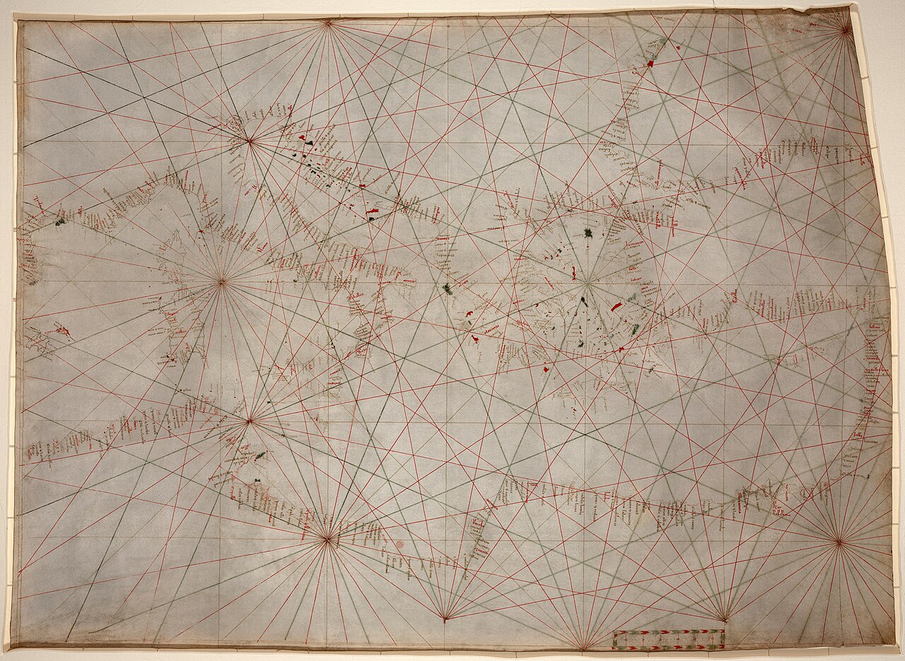
Figure 2.2. Anonymous Genoese portolan chart, c.1325–1350. Its dense network of compass-bearing lines shows that rhumb-line navigation was already central to Mediterranean seafaring long before Mercator's 1569 projection. Library of Congress. Public domain.
That was the trick, and its value is clearer if we forget modern navigation for a moment. A phone can now tell a driver where they are, where they are going and how to recover after a missed turn. A sixteenth-century chart sat on a table. The navigator supplied the intelligence.
Mercator made one part of that work easier. A constant compass bearing could be drawn as a straight line and handled with ordinary instruments on paper. The compass and chart could speak the same angular language. The sea remained difficult. The paper became easier.
That straightness did not make the route the shortest path across the Earth. The shortest route between two distant points on a sphere is generally a great-circle route, and its compass bearing usually changes as the journey proceeds. This is why long-distance airline routes can look curved on a rectangular map even when they are shorter than a straight-looking alternative. Mercator’s achievement was different: he made constant bearing straight.[3]
To buy that convenience, he had to stretch the world. Lines of longitude converge toward the poles on a globe. On Mercator’s projection they appear as straight, parallel vertical lines. The east-west scale therefore increases as latitude rises. To preserve local angles, the north-south scale increases by the same factor. Cartographers call the resulting property conformality.
The word is more complicated than the idea. Very small shapes preserve their local angles. A tiny compass direction on the chart behaves consistently even though the scale of the map changes from place to place. This is precisely why the projection works so well for the navigational problem Mercator chose to solve.
The price becomes obvious in area. On a simple spherical Mercator, local linear scale grows approximately with the secant of latitude.[4] At the equator the factor is one. At 60 degrees north or south it is about two, so a small feature is doubled in each linear direction and its local area on the map is roughly four times what the equatorial scale would suggest. At 75 degrees the local linear factor is nearly 3.9 and local area inflation approaches fifteenfold.
Countries do not occupy a single latitude, so no whole country can be assigned one neat inflation number without calculation. The broad effect is nevertheless unmistakable. High latitudes receive increasingly extravagant amounts of map space.
Greenland is the famous example because it stretches from roughly 60 degrees north deep into the Arctic. Africa lies largely at much lower latitudes and crosses the equator. Mercator does not apply a special shrinking operation to Africa. It enlarges high latitudes much more strongly, so Africa appears comparatively smaller beside Greenland, Canada, northern Europe and Russia than their true areas justify.
This distinction matters because it explains the map without inventing an intention. The distortion is not an error accidentally introduced after the useful part was finished. It is connected to the useful part. The same stretching that preserves local angles causes scale to grow toward the poles.
Eventually the stretching becomes infinite. A true Mercator projection cannot show the poles at any finite distance.[5] As latitude approaches 90 degrees, the projected coordinate runs away without bound. The map can approach a pole forever without arriving.
This sounds like a philosophical joke, but it follows directly from the mathematics. It also shows how specialised the design really is. A projection that sends the poles to infinity would be a strange candidate if its primary job were to give a balanced visual portrait of the entire planet. For a navigator interested in bearings over the parts of the ocean where ships actually travelled, the bargain could make excellent sense.
Mercator himself did not leave a modern derivation written in the notation used by projection software today. Historians of mathematics and cartography have reconstructed how he may have produced the map using the tables, mathematical knowledge and practical techniques available in the sixteenth century.[6] Joaquim Alves Gaspar and Henrique Leitão’s work is especially useful here because it separates the clean equations familiar to modern students from the historical process by which a sixteenth-century mapmaker could reach the result.
This matters for another reason. It is tempting to tell the story as though Mercator discovered the formula, printed the map, and sailors immediately converted to a new system. Adoption was slower and more complicated.[7] Navigators already had established chart traditions and techniques. Charts were expensive objects. Knowledge circulated unevenly. A technically powerful idea still had to be reproduced, understood and fitted into practice.
The broad historical outcome is clear: Mercator’s projection survived its inventor because other people could use it. Before following that afterlife, one technical distinction needs to be kept tidy. Gerardus Mercator’s 1569 map, the mathematical family of Mercator projections used in later cartography, and the system commonly called Web or Pseudo-Mercator in modern online mapping are related, but they are not identical historical objects.[8] Modern Web Mercator, usually associated with EPSG:3857, belongs to a much later engineering story. Treating a twenty-first-century tile system as though Mercator designed it in Duisburg is rather unfair to both centuries.
The same caution applies to claims about motive. The surviving evidence supports a navigational purpose for the 1569 projection. There is no good historical basis for saying Mercator devised it to enlarge Europe for a later colonial or political agenda. That does not settle what later publishers, states, schools or software systems did with Mercator-style maps. It simply separates the inventor’s problem from the afterlife of the invention.
That afterlife is where the argument becomes culturally interesting. A map can be born for one task and later become useful, familiar or convenient in settings where the original task matters much less. Once that happens, the projection is no longer explained only by the problem it first solved. It has entered institutions, markets and habits.
Mercator’s own map offers a useful irony. The high-latitude enlargement criticised today was inseparable from the geometric property that made the projection valuable to navigators. For a sailor following a constant compass bearing, that bargain had a genuine advantage; for a reader comparing continental area, the same stretching is a genuine disadvantage. The geometry is the same. The job has changed.
Once a navigational projection entered atlases, shops and classrooms, the original navigational reason mattered less to the immediate user. Mercator’s map had solved a sailor’s problem. Its afterlife began when the map escaped the sailor.