CHAPTER 1
THE IMPOSSIBLE MAP
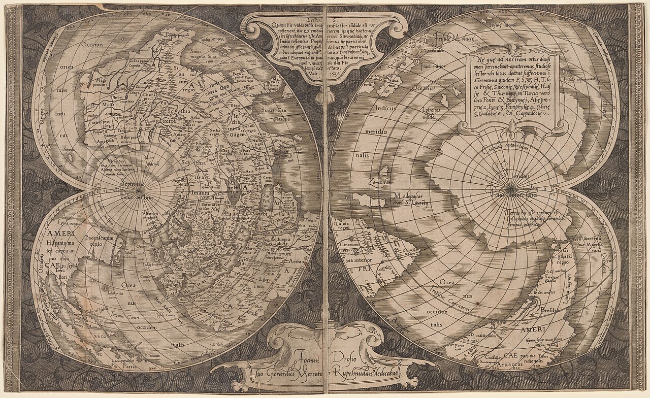
Figure 1.1. Gerardus Mercator's double-cordiform world map, 1538. Three decades before his famous navigational projection, Mercator was already experimenting with very different ways to flatten the Earth. New York Public Library Digital Collections. Public domain.
In the 1820s, Carl Friedrich Gauss spent part of his working life worrying about triangles. These were not the tidy triangles of a school geometry book. They stretched across the Kingdom of Hanover, their corners fixed by survey stations on distant hills, church towers and other points that could be sighted across the landscape.
Surveying a country requires a peculiar kind of confidence in geometry. Measure a baseline carefully, observe angles from one station to another, carry those measurements across the landscape, and a network begins to appear. Roads, fields, rivers and villages can be located inside that geometric skeleton. The method is powerful because the mathematics is dependable, but the surface beneath the network has one inconvenient property: the Earth is curved.
Gauss knew that problem intimately. His work in geodesy fed into his investigations of curved surfaces, and in 1827 he published a paper whose title, General Investigations of Curved Surfaces, concealed a result that later became known as the Theorema Egregium, the remarkable theorem. The mathematics is deep. Its consequence for maps can be stated plainly.
A curved surface and a flat surface do not have the same geometry. You cannot turn the whole Earth into a flat sheet without changing something.
An orange demonstrates the problem with less ceremony. Peel one carefully and try to press the skin flat on a table. If you force one part down, another buckles. Cut the peel and gaps appear. Overlap pieces and some areas cover others. Stretch it and the pieces may lie flatter, but their dimensions have changed. Cartography has spent centuries developing highly sophisticated versions of this kitchen experiment.
Some surfaces cooperate. A paper cylinder can be slit down one side and unrolled into a rectangle without stretching. A cone can be cut and opened into a sector. A sphere cannot be treated that way. The difficulty is not that nobody has yet invented the clever enough projection. A perfect flat world map preserving every area, distance, angle, direction and shape does not exist.[1]
That fact is the starting condition of map projection, not an accusation against it. Every flat world map changes something. The useful question is what it changes, how much, where, and what the map gains in return.
The word distortion can make this sound more sinister than it is. In ordinary language a distorted account is misleading, and a distorted photograph may have been manipulated. In cartography, distortion begins as geometry. Criticism becomes meaningful only when the map’s purpose is known. A distortion can be unavoidable and still be a poor choice for a particular job.
A famous map of London makes the point without showing the world at all. In 1933, passengers on the London Underground began encountering Harry Beck’s diagram of the rail network.[2] It treated geography with extraordinary freedom. Curving lines became horizontal, vertical and diagonal strokes. Stations were spaced for legibility rather than literal distance. Central London expanded while the outer network contracted. The River Thames was simplified into a clean visual guide.
As a measured plan of London, the diagram was wrong in many ways. As a tool for answering “How do I get from this station to that station?”, it was brilliant. A passenger usually needs to know which station comes next, where to change and how the lines connect. Beck sacrificed geographic distance to protect network structure. Nobody looks at the diagram and concludes that Paddington has been moved without planning permission.
World maps deserve the same first question: what job is this map trying to do? The difficulty is that a world map does not advertise its purpose as clearly as a transport diagram. A road map is visibly about roads. A weather map is visibly about weather. A cadastral map is visibly about parcels and boundaries. A world map can appear to be simply the world, as though the continents have arrived on the page without mediation.
The continents have not arrived on the page without mediation. The moment the curved surface becomes a plane, a bargain has been made.
Suppose a mapmaker decides that relative area matters most. If one region covers twice as much of the Earth as another, the map should give it twice as much area on the page. An equal-area projection does this.[3] It is an excellent property for maps where the reader is comparing territorial extent or quantities tied to surface area. The price is that shapes must change somewhere. A continent may stretch, bend or compress while its area remains correct.
Suppose instead that local angles matter. A conformal projection preserves angles at sufficiently small scales, so tiny shapes remain locally similar even though their size may change across the map. This can be extremely useful where bearings and local angular relationships matter. The price can be severe area distortion.[4]
A third approach is compromise. Rather than preserving one property exactly, a compromise projection distributes several kinds of distortion so that the whole map looks reasonably balanced. This is not indecision. If a general reference map has several jobs at once, a carefully controlled compromise may be exactly the property the designer wants.
There are other possibilities. A projection can preserve distance from one chosen point. It can preserve direction from a centre. It can be designed around a particular region. It can cut the oceans to reduce distortion over land. Each choice protects something and spends the distortion somewhere else.
The principle is easier to remember than the vocabulary. Map projections have properties rather than moral scores.
Gauss helps explain why those trade-offs cannot be escaped. His theorem showed that curvature is intrinsic to a surface. A creature living entirely on that surface could, in principle, detect its curvature by making measurements without ever stepping outside it. A flat sheet has zero Gaussian curvature. Roll the sheet into a cylinder and it can still be unrolled without stretching because that kind of bending has not changed its intrinsic geometry. A sphere has positive curvature. Its geometry cannot be transferred intact to a plane.[5]
Something must give, and for a general reader that is enough mathematics to close the door on the perfect flat world map. The rest of projection design is what happens after accepting the loss.
Nineteenth-century cartographer Nicolas Auguste Tissot offered a particularly useful way to see where that loss goes. Imagine the globe covered with thousands of tiny identical circles, all the same size. Project the globe onto a flat map and watch what happens. On some maps the circles remain circular but grow or shrink from place to place. On others they become ellipses, stretched more strongly in one direction than another.
Those imaginary shapes reveal the local behaviour of the projection. A conformal projection keeps very small circles circular, although their size can vary dramatically. An equal-area projection keeps their area constant, although the circles may become stretched ellipses. No world map can keep every one of them identical everywhere.
Tissot’s idea is valuable because it turns an abstract statement about distortion into a diagnostic habit. When a map looks strange, ask what it has chosen to preserve. When it looks normal, ask the same question.
The second question can be more revealing. Familiarity is one of cartography’s best disguises. An unfamiliar projection announces itself because Africa looks wider, South America bends differently or the outer meridians curve. The map someone grew up with may feel neutral simply because its particular distortions have become visually ordinary.
That does not mean the familiar map has secretly rewritten the viewer’s mind, or that an unfamiliar map is automatically better. It means appearance is learned as well as measured. A technically appropriate projection can still look odd because readers recognise the outlines of countries almost like logos. Change the projection and those mental shapes bend.
The result is a design problem as much as a mathematical one. A real map has to work for geometry and for people. It has to protect the property that matters while remaining readable enough that users understand what they are seeing.
Asking for the “true” flat map therefore leads nowhere useful. A globe avoids flattening the whole Earth at once, but a page, wall map or static screen must choose what to protect. Once that choice is visible, criticism becomes more precise: area, angles, distance, direction or a deliberately balanced compromise can each matter for different jobs.
In 1569, Gerardus Mercator faced a particularly practical version of it. Sailors were trying to reason about direction on a curved Earth while working with a flat chart and a compass.[6] Mercator found a way to make one kind of route behave beautifully on paper. To do that, he accepted a distortion that would become spectacular toward the poles.
There was no perfect map waiting for Mercator to ruin, only an impossible problem in which he had to choose which part to solve.