PROLOGUE
THE DAY THE WORLD MAP CHANGED
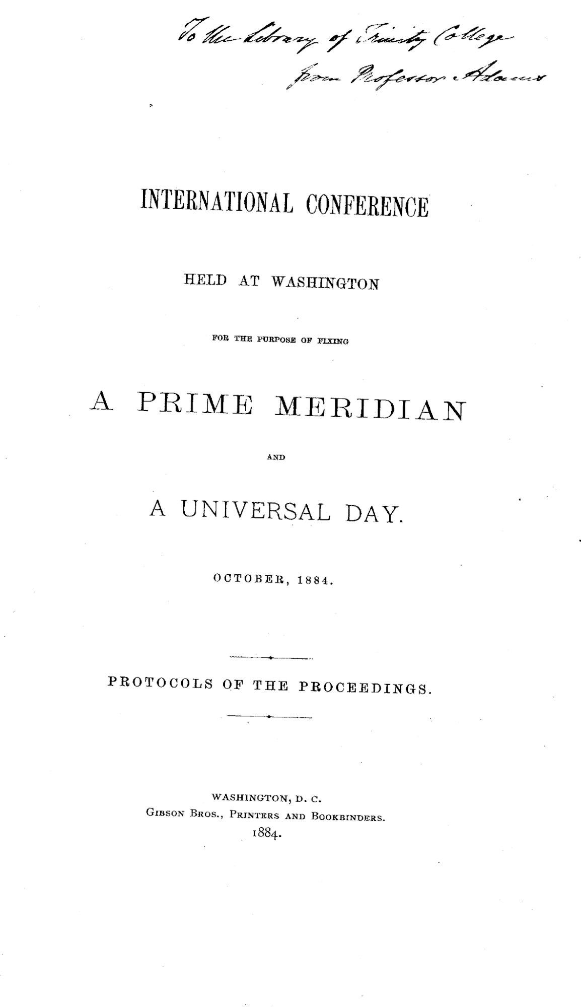
Figure P.1. Title page from the published record of the 1884 International Meridian Conference. Long before the events of 2026, governments had already gathered to negotiate a global cartographic convention and turn it into shared infrastructure. Wikimedia Commons scan of the conference proceedings. Public domain.
On Friday 4 September 2026, the United Nations General Assembly found itself voting on something most people never imagined becoming a matter for international diplomacy: how the world should be represented on a flat map.
The item appeared in the Assembly’s 114th plenary meeting under the dry administrative language of Item 13. The draft resolution was A/80/L.104.[1] Its title was less dry: “Correct the Map”. There are moments when bureaucracy accidentally writes a good book title.
Togo presented the initiative on behalf of the African Group, with the backing of the African Union.[2] Its immediate cartographic complaint could be explained without much jargon. On the familiar Mercator world map, places far from the equator expand dramatically in apparent area. Greenland, Canada, northern Europe and Russia receive much more map space per square kilometre than regions nearer the equator. Africa, which spans the equator and lies largely at low and middle latitudes, therefore appears much smaller beside them than it really is.
Campaigners wanted institutions to use world maps that represented relative land areas more faithfully. Equal Earth, a modern equal-area projection designed by Bojan Šavrič, Tom Patterson and Bernhard Jenny, had become the campaign’s most visible alternative.[3][4] On an equal-area map, if one region covers twice as much of the Earth as another, it also occupies twice as much area on the page. That did not make Equal Earth perfect. It made it good at the property now under argument.
The resolution passed overwhelmingly.[5] The adopted text became General Assembly resolution A/RES/80/307.[6]
If history had been written by headline alone, this would have been the day the old world map was removed and a new one installed in its place. The actual change was stranger and more interesting.
No technician in California had to sprint across a server room and pull a large lever marked MERCATOR. Ships did not lose permission to use Mercator charts. School caretakers were not ordered to remove every rectangular world map before Monday morning. The resolution was non-binding.[7] It encouraged governments, schools, international organisations and technology companies to use Equal Earth or other equal-area maps when relative size mattered, and to teach the limitations of flat maps. The African Union welcomed the vote and called for progressive uptake by international institutions, schools, publishers and digital platforms.[8]
A map projection had become a diplomatic issue, a fact worth pausing over. Map projections usually live in the technical background. They are the machinery that turns the curved Earth into a flat image, often unnamed and largely unnoticed by the people looking at the result. Yet here were diplomats from almost every country in the world casting votes about one of those hidden choices.
The dispute did not begin because cartographers had suddenly discovered that Mercator distorts area. That has been known for centuries. Nor did it begin because Mercator had ceased to be useful. A projection that is poor for comparing continental area can still be excellent for another job. The argument arose because a specialised way of drawing the Earth had acquired a life far beyond the problem it was originally designed to solve.
Gerardus Mercator published his famous world map in 1569.[9] He was trying to make navigation easier on a curved planet. His projection allowed a sailor following a constant compass bearing to treat that route as a straight line on the chart. The result was ingenious. The price was a scale that grew rapidly towards the poles.
Five centuries later, the navigational solution had become one of the most recognisable pictures of Earth. It had travelled through atlases, classrooms, government offices and, in a related digital form, into the architecture of web mapping. A technical choice had become familiar enough that many people no longer noticed it as a choice.
The larger story behind the vote begins with a set of harder questions. How does a tool become a convention, a convention become an institution, and an institutional design choice come to feel natural? What happens when people who dislike the consequences of that convention persuade governments to reconsider it?
Those questions are harder than asking whether Mercator is good or bad. They lead into navigation, printing, schools, surveying, law, war, satellites, databases and software. They also lead into politics, because maps do more than calculate positions. They are used to organise territory, teach geography, record ownership, define boundaries and present the world to people who may never stop to ask why the picture looks the way it does.
The 2026 campaign brought one particular consequence into public view: relative area. Africa did not need to become larger. Greenland did not need to become smaller. The Earth had not altered between one projection and another. What changed was how much flat space the map gave to different parts of the curved surface.
That distinction sounds simple once explained. Before explanation, the map can feel like the world itself.
A wall map is especially good at this illusion. It presents every continent and ocean inside one bounded frame. The centre looks like a natural centre. The top looks like a natural top. The places cut by the edge look as though they naturally belong there. Familiar outlines seem to confirm that nothing unusual has happened. The mathematical bargain disappears into the picture.
The United Nations vote made one of those bargains visible again. It did not abolish Mercator or produce a single official replacement map for every purpose. It did something subtler. It turned an inherited cartographic choice into an international public question.
That question matters particularly from New Zealand and the Pacific, where the edges and seams of familiar world maps are hard to ignore. Aotearoa often sits near the margin of a Greenwich-centred world. The Pacific is frequently divided between two edges. None of that makes the map wrong by itself, but it is a useful reminder that a world map has been arranged by someone, for some purpose, according to some set of choices.
The book that follows is about those choices and what happened when they became useful enough, powerful enough or familiar enough to outlive the reasons that first produced them. It begins before the politics, before the software and before Mercator himself, with the awkward piece of geometry underneath every argument about a flat world map.
The Earth is curved. The page is not. Everything else follows from that.