EPILOGUE
CHOOSE YOUR DISTORTION
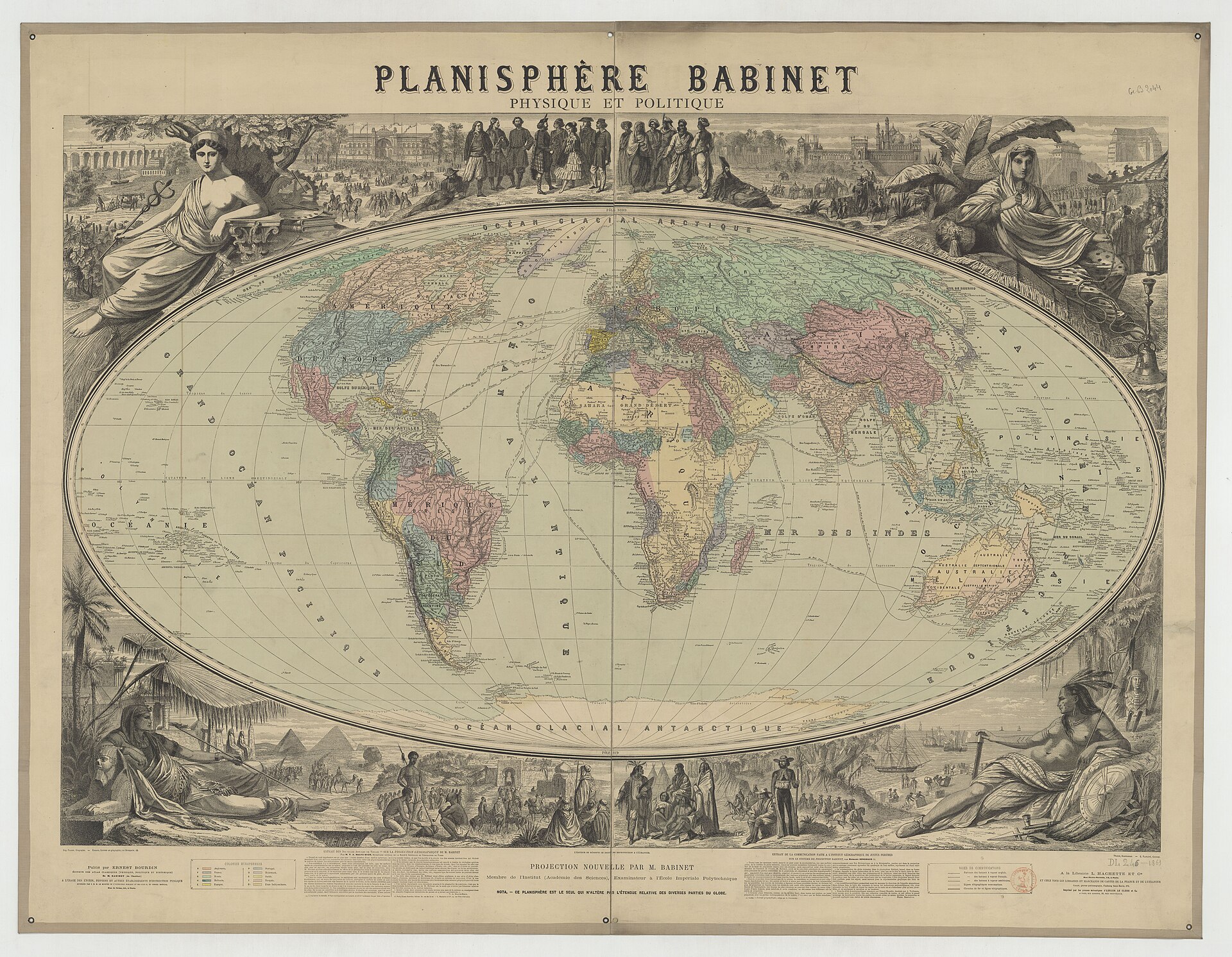
Figure E.1. Planisphère Babinet, 1864, a wall map on the Mollweide/Babinet equal-area projection. Its elaborate nineteenth-century design shows that arguments over how to flatten the world long predate today's projection debates. Jacques Babinet; Bibliothèque nationale de France (Gallica). Public domain.
The next time a world map appears in front of you, resist the first temptation to decide whether it is right or wrong. Ask a more useful question: what is this map trying to do?
That question changes how the map should be judged. A flat map cannot carry every property of the curved Earth onto a page or screen intact. It protects some relationships and damages others. The useful test is therefore not whether distortion exists, but whether the distortion suits the job.[1] A map that is excellent for one purpose may be poor for another without either judgement being contradictory.
The phrase that has run beneath this book can now be stated in full: Accurate for what purpose? If the map asks the reader to compare the size of countries or continents, relative area matters. If it asks about a route, the geometry of distance or direction matters.[2] If it shows a polar region, the way the pole is represented matters. If it is a local engineering map, the requirements are different again. The map should be judged against the task it has been given.
That habit makes criticism more precise. Instead of stopping at the familiar claim that every projection distorts, ask what property has been preserved and what has been sacrificed to preserve it. Look at the parts of the map where the distortion becomes most visible. Check whether the projection is appropriate to the comparison the map is encouraging you to make. A world map can look familiar and still be badly matched to its purpose. It can look unfamiliar and still be technically appropriate.
Projection is only one layer of the choice. Ask where the map is centred and where it is cut. The centre determines what the reader meets first. The seam determines what is divided, pushed to the edges or made awkward for software and the eye. For readers in Aotearoa New Zealand and across the Pacific, that question is especially revealing because a region that so often appears at the edge of one conventional world view can move towards the middle simply by changing the frame. Nothing about the planet has moved. The audience has.
Then ask what the map leaves out. Every map omits more than it shows. A political map may hide topography. A climate map may simplify borders. A military map may make infrastructure prominent and everyday life almost invisible. A data dashboard may display countries as clean polygons while concealing uncertainty, disputed boundaries or gaps in the underlying data. Omission is not automatically a flaw. It becomes a problem when the reader mistakes selection for completeness.
The same discipline applies to authority. Who selected the projection, the centre, the labels, the boundary lines, the categories and the data? Was the choice made by a cartographer, a software library, a government agency, a publisher, a teacher, a campaigner or an inherited template that nobody recently reconsidered? The answer does not tell you whether the map is good or bad, but it tells you where to look for the reasoning behind it.
Defaults deserve particular attention because they often arrive without an argument. A projection can become familiar through repetition, software support, institutional habit and accumulated infrastructure. Once it is familiar, its choices become harder to see. The most useful response is not to assume that every inherited standard is suspect. It is to ask whether the reasons that once made it useful still match the present task.
This is also where evidence matters. Maps can affect what people notice, remember and infer, but those effects should not be asserted more strongly than research allows. If somebody claims that a projection changes political beliefs, produces a particular bias or causes a policy choice, the psychological step needs evidence of its own. Mathematical distortion can be measured directly. Human interpretation has to be tested.
That distinction prevents the debate from collapsing into moral labels. A projection can be overused without being a villain, and another can be valuable without being perfect. Cartographic, historical and psychological claims should each carry the evidence appropriate to them.
Seen this way, a map is less like a verdict and more like a tool with a specification. The reader’s job is not to demand that one representation solve every problem. It is to understand what the tool was designed to protect, what it gives up and whether those choices are visible enough for the task at hand.
Digital mapping makes those choices more flexible because a screen can change representation with scale, location and purpose.[3] That flexibility increases the responsibility to reveal enough of the method for the user to understand what has changed. Sometimes a projection label is enough; sometimes the map needs a note about scale or uncertainty, or a comparison that makes the trade-off visible.
There is a simple reading habit that helps with almost every world map: look at the centre, then look at the edge. The centre tells you what has been given prominence. The edge often reveals the machinery. It is where the seam appears, where regions are divided, where longitude wraps, where polar limits become obvious and where the chosen frame stops pretending to be the whole Earth.
Then return to the map’s purpose. Does the property it preserves match the question being asked? Does the distortion matter to the message? Does the map’s framing make one comparison easier while making another harder? What has been omitted? Who chose the design? What evidence supports any claim about how viewers respond to it? These questions do not make map reading cumbersome. With practice, they become as ordinary as checking the scale bar or reading the legend.
Five centuries of projection history do not end with one generation discovering the correct flat world map. They show how a familiar representation can accumulate technical, cultural and political authority without becoming inevitable. The useful outcome is not to replace one unquestioned picture with another, but to make readers more capable of seeing what a map asks them to accept. Once the choices are visible, disagreement can move from slogans to properties, purposes and evidence.
So the final habit is not a preference for one projection. It is a sequence of questions. What is this map for? What does it preserve? What does it distort? What does it omit? Where are the centre and the seam?[4] Who selected those choices? What evidence supports any claim about how the map affects the people who see it?
A map that answers those questions well does not need to be perfect. It needs to be fit for purpose and honest enough about its compromises.
Distortion is unavoidable. The choice of distortion is not. Once you can see the choice, the world map becomes more informative, not less trustworthy.